"...and it's you are whatever a moon has always meant
and whatever a sun will always sing is you

here is the deepest secret nobody knows
(here is the root of the root and the bud of the bud
and the sky of the sky of a tree called life;which grows
higher than sould can hope or mind can hide)
and this is the wonder that's keeping the stars apart

i carry your heart(i carry it in my heart)"


-E.E. Cummings

Followers

If I Had My Druthers: (Fave Movie, Bands, Color and Hobbies)

  • The Breakfast Club
  • Panic! At the Disco
  • Safety Suit
  • Train
  • The Goo Goo Dolls
  • Orange
  • Scrapbooking (duh!)
  • Writing
  • Photography

Thursday, September 29, 2011

New Page for Sassy Lil' Sketches

I saw the week four sketch at Sassy Lil' Sketches, and knew I had the perfect peices at home for my interpretation of the sketch. :) Here is the sketch:
And here is my page:

This is a picture of my Dad and I at a Luau party thrown by a friend. It was such a fun day, and we love this picture! :) Here are some close-ups:

In place of a flag banner, I used the lei from the party for texture and the pretty colors! I cut it into two pieces, and glued the petals in the arrangement I wanted. :) I painted the letters with glitter paint and glued them with 3-D foam dots at different levels for even more texture.
I cut one of the flowers off the lei for a pop of color at the top of the photo. I couldn't resist having at least ONE button. ;)

Here's a close-up of the squares of paper and the journaling. After I found papers that best complemented my photo, I cut them into rectangles and squares, then outlined them in glitter paint. The journaling is attached with 3-D foam dots to visually separate the squares and the journalling. :)

I hope you like this page! It's one of the most colorful I've done, and I love it. :)

Tuesday, September 27, 2011

Once Upon A... Sketch :)

So the September 15th challenge for Once Upon A... Sketch. :) It took me a really long time to figure out exactly what I wanted to do with the picture I used for this challenge, because it's very special to me. Here is the sketch:
The extra challenge was two lines of journaling directly on your photo. And here is the page I came up with:
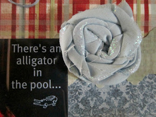
This is a picture of my Pa and I when I was about ten years old. It's one of my very favorites! I knew that this picture deserved a very special page, and so I waited for a long time, collecting the right papers, and making my own embellishments. :) The journalling on the photo says "There's an alligator in the pool". It was always kind of an inside joke with Pa and I, and when deciding what I wanted on the picture, I knew this was perfect.
Here are some close ups:

I cut these letters from a paper I thought complemented the green in the main paper, and I hope they look alright because I did them freehand without a stencil or anything. :) I think they turned out good. :)

I made this flower out of fabric, with the intention of pulling out the blue in both papers, the lettering on the photo, and the blue in Pa's coveralls. After the flower was finished, I used some glitter paint to add some "dimension" to the petals. The edges frayed a little bit, but I really like the overall look.

To emphasize the red in the paper and the photo, I cut my journalling tag out of red cardstock. :) As you can see below the journalling, I glued thread in the same shade as the flower and the journalling on the photo to the page. It was quite the happy accident actually!! :D I had been thinking of doing something else with the thread, but it wasn't working out, so in a moment of creative frustration I tossed the thread onto the page, and it landed so... beautifully across the bottom. It was amazing! So I tweaked it a tiny bit, added some glue dots, and was very happy with the look! I put butterfly stickers on one end, and a button on the other (this is a picture of the thread at the top of the page:

So, that's the page. :) I am proud of it. And I think that in all my hopes of wanting the perfect page to display this photo that I treasure, I didn't have to try so hard to make it perfect. It was perfect all along, all by itself because it's a perfect memory.


Thursday, September 22, 2011

White With 1 :D

I have been following White With 1 for a while, and I finally decided to participate in the challenge. :) I've been trying to challenge myself to grow creatively, so I've been scrapping and crafting ALOT! I love all of these amazing challenge blogs, because they're such beautiful outlets for so many people's amazing creativity. :) So, enough chatting. The challenge for September was to use: White + Pale Pink + Journal on your photo. And here is my page:
 This is a picture of Mom and I when I was teeniny. :) I had a horrible case of the chicken pox, and Mom and Dad had rubbed calamine lotion all over me. :) So the pale pink was perfect! :) I stamped "You are my sunshine, My only sunshine" across the photo and the page, because that's our song. :) Here are some close ups (finally!):

Here is the stamping. Sorry about the shadow... :( But you can still see it. :) I bought these little bitty alpha stamps in the dollar bin of Target, and used a paint I mixed to put the base pink down. After it dried I went over the letters with the same gel pen I used for the journaling at the top of the page. Also, I used the paint to go around the edges of the photo and the lace to mimick the calamine lotion spots in the picture. :)

Here I cut out a swirl from the edge of the paper that I used for the background of the photo to pull out a little more pink. :) I finally found a place to use a package of butterfly stickers that I have had for months!!! I was so excited. :) And then I added a daisy because my mom and I both love daisies. As you can see, I added some paint under and around the swirl also, leaving some bits unglued to add 3-D texture.
Here's a close up of the lace. :) As I said earlier, I painted the edges of the lace, and then added a few buttons for to add to the "sweet" look I intended for the page. And, another of the butterflies I mentioned.

So, I hope you liked this page. I love it so very much, not only because I worked hard on it but because it makes memories that are very special to me with my Mom a tangible thing. :)

Tuesday, September 20, 2011

Stuck?! Again. :)

The September 15th sketch at Stuck?! (http://stucksketches.blogspot.com/2011/09/september-15th-sketch.html) is so lovely, and when I saw it, I knew I had the perfect photo for the LO. As a very novice scrapper, I have so much to learn. I love participating in these challenges, because I get to grow in my own creativity, and be inspired by the wonderful work of others!  Here is the sketch:

And here is my page:
This picture is of David and I at his brother's wedding. :) We danced so much, and it was a beautiful day I'll never forget. I've been hanging on to this pic for a while, just waiting for the perfect inspiration.  Here are some closeups:

Here is the title/journaling. The little letters weren't showing up well, so I outlined them with black sharpie pen. The larger letters (DANCED) were brown punch-outs that I painted with gold glitter glue, and also outlined. The buttons are from my personal button box. :)
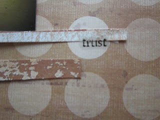
I've been looking for a place to use these sticker words, and used two on this page, "trust" here and "love" up in the left-hand corner.
I love this quote sticker. It was so perfect for this picture, especially. :) The little diamond is actually a floor tile meant for a doll house, but I loved the gold and white pattern. As you can see, I added some lace under the strips of paper for some texture.

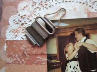
I have no clue why this buckle seemed so important to have on this page... But as one of my favorite quotes states: “When the creative impulse sweeps over you, grab it. You grab it and honor it and use it, because momentum is a rare gift.”
Justina Chen Headley, North of BeautifulI saw the buckle, and I knew I wanted it there. :) I think it works nicely. Here is the other word sticker (love).

And finally, a close up of the doilie I used. It's paper, purchased from Hobby Lobby. And Yay, yay, yay, for me: I finally got some of the amazing distress ink by Tim Holtz!!! :D I used the lovely Tea Dye color, though there are what seems like HUNDREDS to choose from. :)

So this is one of my favorite pages so far. Like the memory of that day, I will treasure it forever. :)

Tuesday, September 13, 2011

Beyond the Door Scrap Challenge. :)

At Beyond the Door Scrap Challenge ( http://beyondthedoorscrapchallenge.blogspot.com/), they opened a door into a lovely room this month. :) This is the room:
 

Isn't it beautiful! I wish my laundry room looked like this... Rather, I wish I had a laundry room! :D
This the LO I made to follow the inspiration image:

This is a picture my mom took of me in Galveston, and I love it! There was a giant compass, and I just had to have a picture with it. As I am establishing myself in the college community, and figuring out all the responsibilities of being an adult while still recongnizing that in some ways I depend on others, I have had to adjust my course... A lot. But, I am finally starting to feel grounded. And so, this page was born! I am beginning to find my direction... Thank you, Beyond The Door, for providing the boost I needed to get this page done. Here are some close-ups:

I am enjoying a bit of a button fetish lately!! :D I wanted som detail around this journaling, so I used these perfect buttons, and a little purple butterfly sticker.

I wanted to mimic the flowers on the left side of the inspiration image, so I cut these glittery flowers from a different piece of scrapbook paper, curling the edges slightly for a pop of 3-D detail.


The butterfly I cut from the same page as the flowers for an embellishment, and the title... :)


And finally, a close up of the picture. :) Yay! 


Thursday, September 8, 2011

ARTastic Page... :)

I have been following ARTastic for a while now, but haven't quite gotten up the guts to enter... Until now. :) As a very beginner scrapbooker, I feel very timid about submitting anything after looking at the gorgeous layouts of other more experienced scrappers. But, I figure, how does one learn unless you challenge yourself? So, I am doing just that. I loved the inspiration painting by Van Gogh, and I am very fond of the page I came up with. :)
The inspiration painting:

And the Diva Demands:
1. Blue Background = 1 pt
2. White flowers = 2 pts
3. Brown or White title = 3 pts

And here is the page I created to follow these guidlines:
This picture is of me and one of my best friends, Michael. :) It was taken on the day of our last District competition for FFA, and as such, it accorded a very special page. I used a lot of tissue paper on this layout, to add texture, and because I think it looks a little bit whimsical. :) Here are some close ups:

I made this tag using a stencil set I just recently bought. I then layered some carefully torn tissue paper between the smaller and larger tag (which I colored on with blue gel pen), and then adhered blue beads to the top tag. The loop is tissue paper, and so is the strip running along the left side of the page. :)
I made these two flowers using stencils. I added glitter paint to the edges/center for some shine, and on the bigger flower added a small rhinestone. :)

I made the small banner out of, again, tissue paper. :) I searched through my button box until I found these buttons and rhinestones for some sparkle.

Overall, I really love this page, and hope you enjoyed looking at it. :)

Stuck?!

The September 1st Inspiration from Stuck?! (http://stucksketches.blogspot.com/) is so lovely! I just recently enjoyed a family vacation to Galveston, so I have tons of pictures just begging for pages. :) Here is the sketch:

And here is the page I made:
The focus photo is a picture of me and my Dad on the last morning of our trip. We got up before sunrise to search for seashells. As you can see, I've attached a few to the page using glue dots. :) The other two pictures were taken that morning also. I had so many sunrise photos to choose from, but in the end this one was my favorite that I took that morning. The picture of the seashell was the only really big shell we found without holes in it, but *of course* it had a hermit crab in it! Since we couldn't take it with us, we had to commemorate it with a pic. :) Here are some close ups of the page:
These letters started out gold, but I wanted them to pick up the orange of the sunrise more, so I added some orange glitter paint.

My journaling is written on a cream piece of paper that I tore out for some added texture. I really want some of the amazing Tattered Angels sprays that I keep seeing on layouts, but until I get some, I'm stuck with good ol' fingernail polish. :) I painted the edges with a translucent gold-glitter polish that catches the light quite nicely. I don't think you can tell in this pic... But it's there! :)

In place of the flower embellishments in the sketch, I glued seashells on the page in a similar pattern. :)

Tuesday, September 6, 2011

Submission for Once Upon A... Sketch! :D

So, I have been looking around at challenge blogs, and I found a beautiful sketch at Once Upon A... Sketch (http://onceuponasketchblog.blogspot.com/2011/09/hi-everyone-and-welcome-to-september.html) that inspired me greatly. Here is the sketch:
Journalling Criteria : A memorable year - Your title must be a year, and you must journal at least 2 lines on why this year is memorable for you. Examples: the year you got married, the year you graduated, the year you moved to a new house/country, the year you started a new job, the year your child was born, the year you lost someone dear. Your journalling can be in any language and any format (written, typed etc)

So, here is the page that this inspired me to make:

And here are some close ups of the page. :)

 I love this picture, and it seemed like such a perfect analogy to me. :) The plastic-y lookin flowers came off of old hair barrettes that I never wear anymore.
 When I started thinking about which year I would choose for this page, I couldn't think of a year that would be better than 2011. So many changes, good and bad. :) The papers overlapped behing the photo here actually were on a greeting card I found in our craft room, and I loved the colors. So I cut the card up and this was how I decided on a color scheme. :)
I wanted to add a little texture to the journaling so this is what I cam up with. Next time I might try the overlapping bits of paper in a different color that would complement the color scheme. :) I made the flower and the swirly thing. :)